RKN Brand Identity

“The store's architecture, redrawn as a wordmark.”

“The store's architecture, redrawn as a wordmark.”

The RKN logo embossed in glossy black-on-black, its mirrored Latin-and-Arabic wordmark catching the light.

Project Overview

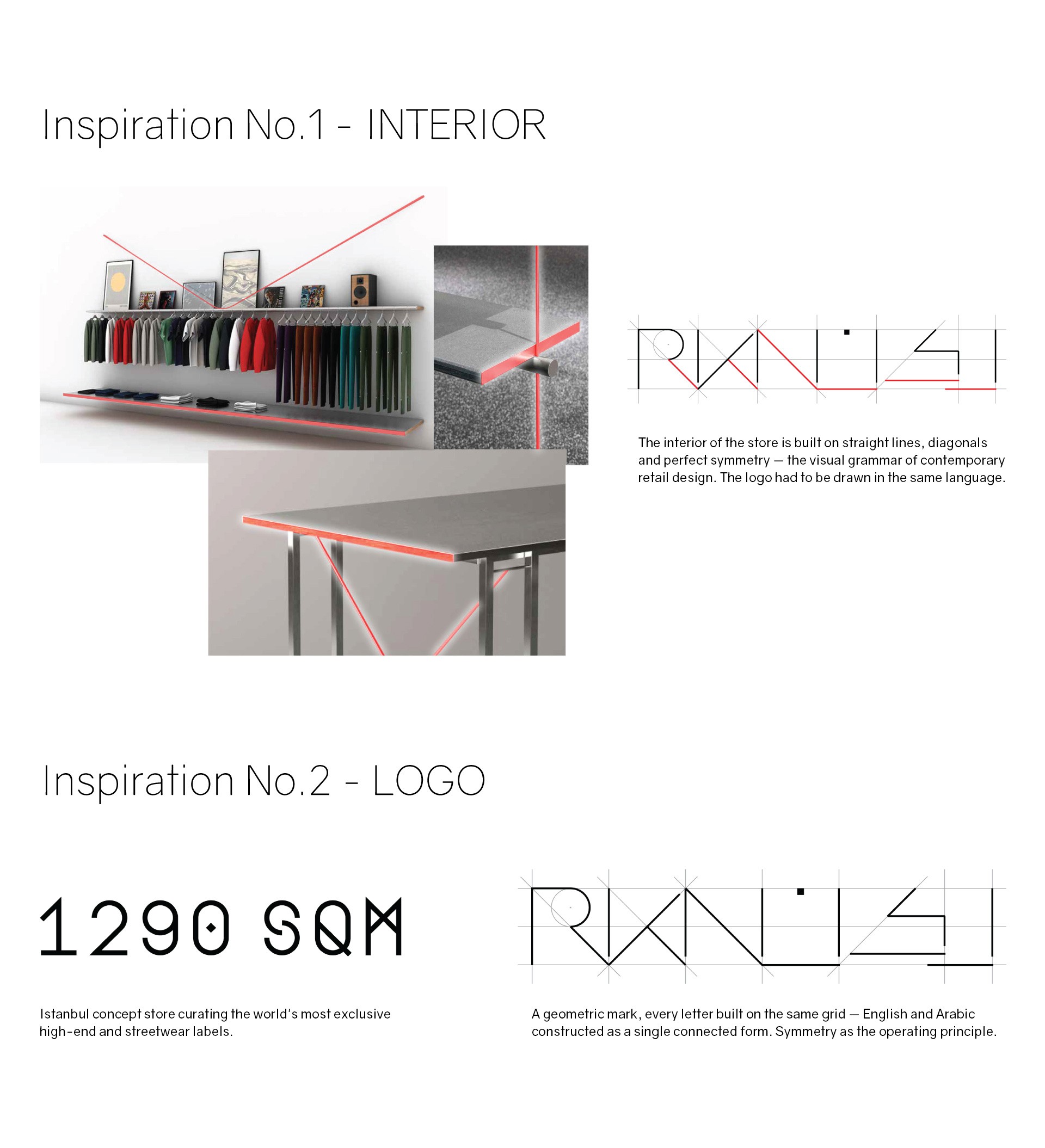
RKN was a premium concept fashion store in Doha, carrying high-end and streetwear labels under one roof. The brief was a complete brand identity — logo, supporting graphics, typography, color palette, and a full applications system. The logo was derived from the geometry of the store itself: straight lines, diagonals, perfect symmetry.

This case study was included to show the design discipline underneath the campaign work.

Client

RKN

Role

Branding

Art direction

Fashion

Year

2021

RKN's design rationale: store interior shots with highlighted architectural lines, beside the geometric logo drawn from the same straight-line, diagonal grid.
The RKN wordmark in silver foil, embossed on layered matte-black card, catching the light at an angle.
The RKN brand system: the geometric logo with its "infinite lines" supporting graphic, the Gravity and Gulf typefaces in English and Arabic, and a black-to-white colour palette.
The RKN identity applied across a business card, stationery, a shopping bag, a greeting card, an e-mail signature, and an illuminated storefront sign.